A Five-Minute Rewatch for Screen Transitions
Use a five-minute rewatch of one familiar screen flow to see where transitions begin, what changes, and which information stays visible.
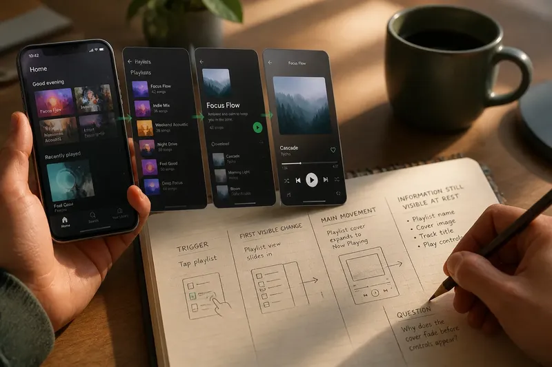
Where does a screen transition begin, and what survives after it ends? A five-minute rewatch of a familiar screen flow can answer both questions without turning the viewing into a design audit. Choose a short sequence you already know, such as opening a music app, choosing a playlist, and starting a track. Watch once at ordinary speed, then replay it with attention narrowed to motion.
Choose One Flow
Keep the subject small: one route through one interface, rather than an entire app. A settings panel opening, a map search result appearing, or a message thread switching to a photo preview can each make a useful subject. Familiarity matters because you already know the intended destination. That lets you notice how the transition carries you there.
Use a screen recording, a saved clip, or a live interface you can revisit. A desktop screen recorder such as QuickTime Player or the built-in recording tool on a phone can help when the sequence is difficult to repeat. Do not hunt for an elaborate example. A plain menu, tab switch, or expanding card often exposes more than a polished cinematic sequence.
Set a timer for five minutes and keep a scrap of paper nearby. You are not trying to judge whether motion is attractive. Record three observations: where movement starts, what changes while it runs, and what remains visible once the new state settles.
Watch the First Pass
Let the flow play without pausing. Notice the first moment that asks for your attention: a tap, a loading cue, an expanding panel, or a change in the whole screen. Then watch the transition as a continuous event. Does one object move into a new position? Does a layer appear over an unchanged page? Does the previous screen disappear entirely?
On the second viewing, mark the beginning more precisely. A transition may start before the obvious movement. A button may dim when pressed, a label may change, or a small indicator may appear before a panel slides in. These early changes tell you when the interface has registered an action, even if the destination has not arrived.
Separate the trigger from the motion. The trigger is the event that starts the change, such as selecting a folder. The motion is the visible behavior that follows, such as the folder opening while its contents enter view. If the two feel disconnected, note the gap rather than assuming the animation itself is the problem.
Track What Changes
Watch for changes in position, size, opacity, shape, and order. A card might enlarge into a detail view; a toolbar might stay put while content beneath it shifts; a new sheet might cover part of the previous screen. You do not need technical labels for every effect. Plain descriptions are more useful than guesses about the underlying code.
Ask what the movement implies. When a small thumbnail grows into a full image, the interface suggests continuity: this is the same item, now shown in greater detail. When a panel enters from the side, it may imply a layer beside the current page or a route to another place. Those meanings are not automatic, so compare the motion with the visible labels and controls.
Imagine you are rewatching a fictional recipe app. You tap a saved dish; its thumbnail expands into a recipe page, while the dish name stays in view and the ingredient list appears below. Note that the image changes scale, the title preserves the item’s identity, and the new text supplies the next task. The observation is about the transition’s visible parts, not whether the imagined app is well designed.
Also notice what does not move. A fixed title, persistent tab bar, or unchanged background gives the eye a reference point. If every element shifts at once, the transition may offer fewer visual anchors. That is an observation, not a verdict: the movement may still be understandable if the destination is clear.
Check the Remaining Context
Pause at the first stable frame after the transition. Ask what information is still present from the earlier state. It might be a selected item’s name, a breadcrumb, a back control, a map pin, or a tab that remains highlighted. Then ask what has vanished. A disappearing label can matter if the next screen shows several similar items.
Look for changes that happen together. If a panel opens while a heading changes, the heading may explain the new context. If the heading vanishes as the panel enters, the transition may leave the viewer to infer where they are. Record the visible evidence in a few words: “selected folder stays named” or “old map hidden beneath results.” Avoid filling gaps with assumptions about what a designer intended.
Check whether the interface preserves the action’s outcome. After selecting a filter, for example, does the chosen filter remain marked? After opening a message, does the conversation title remain visible? Such details help distinguish a transition that communicates a continuing state from one that merely moves pixels.
Five-Minute Rewatch?
What should I write down?
Use a short sequence of notes: trigger, first visible change, main movement, and information still visible at rest. Add one question if something remains unclear. Avoid transcribing every frame; the aim is to capture the transition’s meaningful landmarks.
Should I slow the clip down?
Watch at normal speed first, since timing and rhythm are part of what a viewer experiences. Slow playback can help locate a brief state change, but treat it as a close-up rather than the final impression. Return to ordinary speed before deciding what the transition communicates.
What if the screen flow has no animation?
Watch for other changes that mark a transition: a new label, altered selection, loading indicator, or immediate replacement of content. A near-instant switch still has a beginning and an aftermath. Note how clearly the new state identifies itself.
Is a long animation always a problem?
Length alone does not explain whether movement helps or distracts. Notice whether the animation shows a relationship, confirms an action, or delays access to the destination. If it adds no useful information, record that observation without treating duration as a universal rule.
Keep the Notes Useful
Write observations as visible facts before interpreting them. “The title remains while the card expands” is more useful than “the transition feels smooth,” because another reader can picture the event and consider its effect. You can add a separate impression afterward, such as “the title made the new screen easier to place.”
One compact note might read: “Tap playlist; cover grows; title persists; track list appears; back control remains.” That line preserves the event’s sequence without turning five minutes into a report. If you rewatch later, you can check whether the transition still reads the same way or whether a detail went unnoticed.
What is not worth the effort? Naming every easing curve or frame-by-frame movement usually adds little to this exercise. Unless you are preparing a technical specification, focus on what a viewer can see and understand. If the screen includes motion controls or accessibility settings, you can note their presence, but there is no need to investigate every preference for this short rewatch.
A five-minute rewatch of screen transitions is most useful when it ends with one clear observation: what motion begins, what it changes, and what context remains. Keep the clip and your notes together if you want to compare another flow later. The next useful question is often small: which visible element helped you recognize that the screen had changed?