Why Alignment Makes a Screen Feel Easier to Scan
Why alignment makes a screen feel easier to scan: learn to spot stray edges and use shared lines to clarify which labels, values, and actions belong together.
Why does one screen feel easy to scan while another makes you hunt for the next item? Often, alignment is doing quiet work: repeated edges let the eye recognize relationships before it reads every word. Imagine a hypothetical situation in which a small clinic’s appointment screen has all the right information, but its labels, times, and action buttons drift across the page. A careful review of those edges can show what is grouped, what is merely nearby, and which adjustment would make the screen clearer.
Reading the first screen
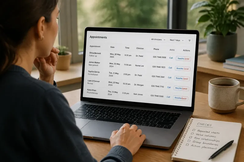
In this invented situation, Mara is reviewing a scheduling interface on a laptop. The screen lists a patient’s appointment, the clinician, the visit type, a phone number, and two actions: “Reschedule” and “Cancel.” The information is accurate and the text is legible. Yet Mara pauses before deciding which time belongs to which appointment.
The appointment names begin at one left edge. The dates sit a little farther right, while the clinician names start at a third position. Phone numbers are centered in their column, but the “Call” links are aligned at the left. The buttons sit below the entries, with their own unrelated edges. Nothing is obviously broken. The problem is that the screen offers several competing cues for how to read it.
Alignment is not simply a matter of making everything line up. It creates visual relationships between separate items. When two labels begin at the same edge, they can read as members of a set. When values share a line or a column, the eye can compare them. A stray edge weakens that signal, even if the stray item is only a little out of place.
For Mara, the useful question is not “Is this perfectly tidy?” It is “Which things should the viewer understand as belonging together, and what repeated line would make that relationship visible?” That question keeps the review focused on meaning rather than cosmetic neatness.
Following the shared edges
Mara starts with the appointment entries, not the buttons. She traces the left edge of each appointment name down the screen. The names share a line, so they look like a list. She then follows each date across to its clinician. Because the dates and clinician names begin at inconsistent positions, the row relationships are harder to perceive.
She checks the screen in layers:
- Repeated starts: Do labels or item names begin at the same edge?
- Value columns: Do dates, times, or status values occupy a consistent position?
- Row relationships: Can the eye connect each value with the label or item on its line?
- Group boundaries: Does a shared edge distinguish one group from another, or accidentally combine separate groups?
- Action placement: Do links and buttons appear consistently beside the content they affect?
These checks reveal why alignment should be read across the whole screen, not one component at a time. A date might align neatly with the date above it but still appear detached from its own appointment name. A button can line up with several rows and suggest that it applies to all of them, even if it belongs to just one.
Mara notices that the “Call” links form a clean column, but their phone numbers are centered. That neat link column does not clarify which number belongs to which patient. The repeated edge serves the interface only if it supports the relationship a viewer needs to recognize.
Repairing one relationship
Say Mara chooses to revise the appointment list rather than redesign the whole screen. She places each appointment name at a shared left edge, then gives dates and clinician names their own consistent columns. Within each row, she keeps the values close enough to their appointment name that the row reads as one unit. The action links stay beside the relevant entry rather than floating at the far edge of the page.
The expected observable result is modest but useful: a viewer can follow a row horizontally, then move down a column to compare appointments. The screen has not gained information. Its existing information has gained clearer visual addresses.
One common temptation is to force every element onto the same left margin. Mara avoids that. A page title, a compact filter, a list of appointments, and a footer action do not necessarily share one relationship. If all are aligned as though they form one group, the screen may look orderly while concealing its structure.
Instead, she asks which edge belongs to which level. The page title may align with the main content area. Each appointment name may align with the next. A row’s time and clinician may align within their respective columns. These nested alignments can coexist, as long as each one reinforces a real grouping rather than adding another arbitrary line.
Finding edges that mislead
Misalignment is easiest to catch when the eye has a stable reference. Mara checks repeated labels, column starts, and the edges of the content area. She looks for items that nearly align but do not, because near-matches can feel accidental: the viewer senses a pattern and then finds that it fails.
She also watches for alignment that crosses a boundary. A “Cancel” button aligned with the start of the next appointment could appear to belong to that next row. A status label aligned with a page-level heading might look like a section title rather than an appointment detail. In each case, the edge is not merely untidy; it gives a plausible but incorrect reading.
To separate a real relationship from a visual coincidence, Mara temporarily ignores color and wording. She notices whether spacing, shared edges, and row structure still make the associations apparent. Then she restores the text and checks whether the alignment supports the meaning rather than competing with it.
It is not worth adjusting every pixel just because an element looks slightly different from its neighbors. If an edge has no role in grouping, comparison, or orientation, refining it may add effort without improving the reading. The question is whether the viewer’s path becomes clearer, not whether every object obeys one ruler.
Why does alignment matter?
How does alignment help the eye scan?
Repeated edges give the eye a path to follow across related items and down comparable values. That can reduce the need to inspect each label separately before recognizing the screen’s structure.
Does every element need the same alignment?
No. Different groups can use different alignments when they represent different relationships. The important part is consistency within each meaningful group and a clear distinction between groups.
How can I spot a misleading edge?
Trace the edge and ask which items it seems to connect. If the implied group differs from the actual relationship, or if a repeated pattern suddenly breaks without a reason, the alignment deserves review.
Should buttons align with their labels?
They should sit where their scope is easy to understand. A button aligned with one row can read as that row’s action; an isolated button may need spacing or placement that makes its broader scope clear.
Checking the revised screen
Mara returns to the full scheduling screen and reads it as a visitor might. She starts with the page heading, finds the appointment list, follows one row, and then compares the dates down the column. She checks whether the “Reschedule” and “Cancel” actions appear attached to the intended appointment or to the list as a whole.
She also checks the layout at a narrower window. A column that is clear on a wide laptop may collapse or shift when the interface has less room. If the columns stack, the order and spacing should still make it apparent which values belong to each appointment. Alignment is a relationship, not a fixed coordinate; the relationship can survive a change in layout if the grouping remains legible.
The hypothetical review ends with a simple distinction: the old screen had repeated information but inconsistent visual relationships; the revised one gives names, dates, and actions more dependable edges. Mara has not made every element identical. She has made the intended groups easier to recognize.
When you review a screen, begin with one question: which items should the eye connect without having to stop and decode them? Follow their edges, look for near-matches and accidental alignments, and adjust only the lines that clarify those connections. That is why alignment makes a screen feel easier to scan: it lets the layout explain what belongs together before the reader has to work it out.