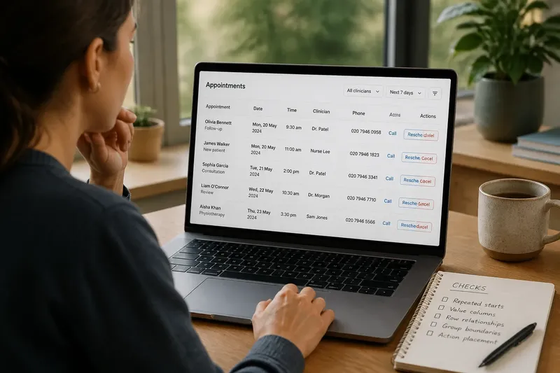
Hierarchy
Why Alignment Makes a Screen Feel Easier to Scan
Why alignment makes a screen feel easier to scan: learn to spot stray edges and use shared lines to clarify which…
Read the screen beyond the obvious.
Browse explanations of screen hierarchy, type, colour, motion and interaction. Each piece takes one visible design choice and asks what it helps a reader notice.
Why alignment makes a screen feel easier to scan: learn to spot stray edges and use shared lines to clarify which…
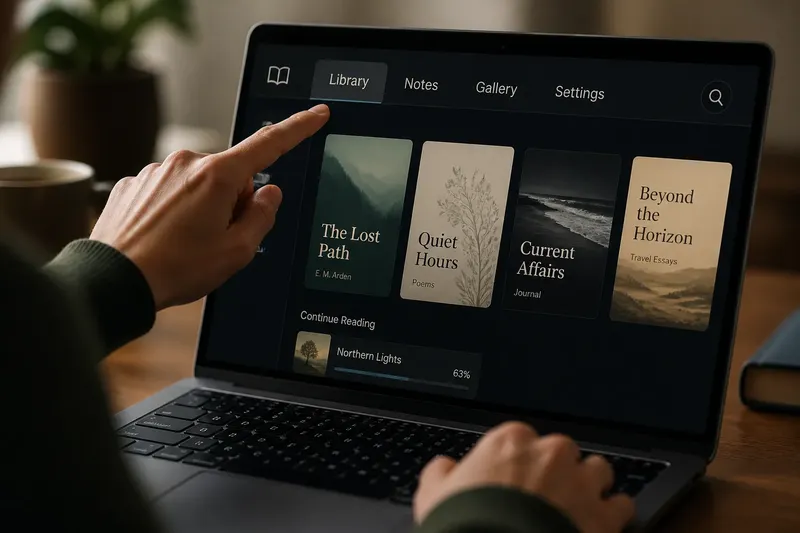
Serif or sans serif for a short screen label? Match type to the label’s letter shapes and length to make names, tabs…
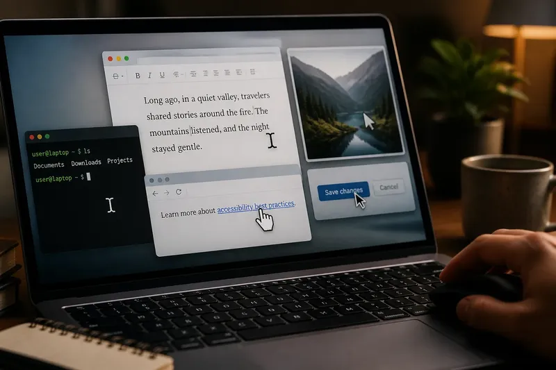
The history of the cursor shows how text markers, mouse pointers, and changing shapes signal where you can type…
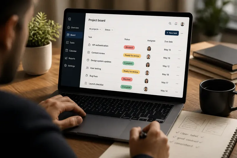
Learn how to use color codes with labels, contrast, and repetition so readers can interpret interface signals without…
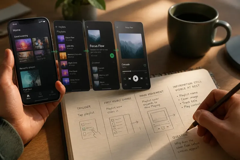
Use a five-minute rewatch of one familiar screen flow to see where transitions begin, what changes, and which…